top of page

CLEAR FROST PACKAGING
Logo Design, Packaging Redesign
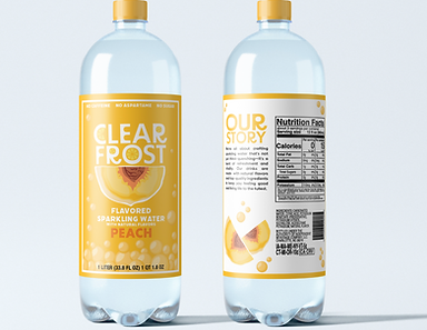
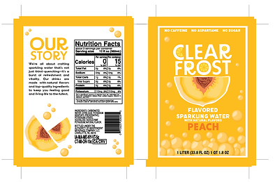
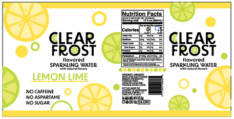
This packaging project was created for a communication design class, where we were tasked with redesigning a product that needed a refreshed look. I chose Clear Frost Sparkling Water, a product that didn’t initially stand out on the shelf. My goal for this redesign was to make it more eye-catching, using bright colors, easy-to-read fonts, and playful design elements like bubbles and fruit illustrations. These enhancements allow customers to instantly recognize the product and its flavors as they walk by. I used Adobe Illustrator to create my design and ended up experimenting with printing the labels onto sticker paper and placing them on the bottles.


ORIGINAL vs NEW


DESIGN PROGRESSION


bottom of page